Types of Menu: Unlocking the Secrets to Effective Restaurant Planning
A menu is the first real introduction to your restaurant. It doesn’t just inform your patrons about the food and beverages you serve and their costs. Your menu also helps shape your restaurant’s identity and sets the bar on what your guests can expect.
You should consider it a core component of your eatery’s marketing plan, as it can subtly influence your guests’ choices. A well-designed menu can make your restaurant’s dishes appealing to your patrons and ensure your kitchen is efficient. This is part of menu engineering and is essential for restaurants.
However, a poor design or the wrong menu type can confuse your guests and affect your operational performance.
In this guide, let’s explore the different types of menus and when you should use them. You’ll learn how to display your menus and what you can do to make them unique. Ready? Well, let’s dive in.
Definition and Purpose of Menus
Let’s refresh everyone’s memory about the menu’s definition — a list of the food and beverages your restaurant can serve. It gives your guests all the information they need about your offerings. Your patrons know how much each dish costs, and some menus describe the main ingredients in an item.
But, it is more than just a list. It can tell the story of your restaurant or your journey as a restaurateur. It portrays your identity, showcases your restaurant’s culinary expertise, and increases brand awareness. It also influences how your kitchen runs during working hours.
Primary Categories of Menus
You can classify the different types of menus into two categories: how you sell your dishes and the food type. Every restaurant is different because of customer segmentation and the cuisines you serve to your guests. So, let’s understand how these menus are different and when you should use them.
Based on Ways Items Are Sold
As highlighted above, the first category is how guests can choose to order dishes from your restaurant.
- À La Carte Menu
À la carte is French for — according to the menu. In the à la carte menu, you list each dish you serve independently. For example, the appetizers, main courses, side dishes, and desserts will be separate.
This allows you to showcase your signature dishes.
Your patrons can choose what they want to order and mix and match as per their preferences. The menu items are more expensive, as the ingredients need to be fresh and high-quality. This is why you’ll find them in upscale restaurants.
- Static Menu
A static menu is one of the most common menu styles, and you’ll find it in most restaurants. You display everything your restaurant can cook in this type of menu. It’s also acceptable to separate the dishes into multiple categories.
They are popular among eateries like cafes and fast-food joints because the dishes are consistent. Moreover, several options make it easy for guests to pick what they want.
These menus attract loyal customers as there will be no changes to their favorite dishes and beverages. It’s also helpful for streamlining operations, as you know what you need and how much you should order regularly.
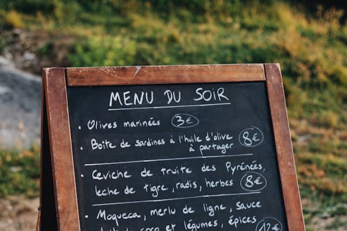
- Du Jour Menu
Du Jour is a French phrase for “of the day.” This menu is great when your restaurant wants to highlight a daily special or focus on seasonal or local ingredients. For example, if you recently purchased mangoes and prepared a dessert, it can go on this menu.
It often goes by the nickname “chalkboard menu,” as you can change this list based on availability. You can even make several updates throughout the day.
This reduces waste, as you only use available ingredients. Additionally, your chefs can be creative, and your restaurant will draw loyal customers who like trying something new. You will use these types of menus with static menus.

- Cycle Menu
In a cycle menu, you repeat specific dishes over a particular period. Generally, the cycle begins at the start of the month. It returns to the original set of dishes by the end of the month. Cycle menus are exciting for your customers because the items change over time.
This allows you to adapt to the season and offer different dishes for your diners. At the same time, it’s not too taxing for your chef to prepare these dishes. It is an excellent menu because your restaurant can offer specials every day of the week.
For example, it can be an alcoholic or non-alcoholic beverage, a signature dessert, a seasonal appetizer, and more.
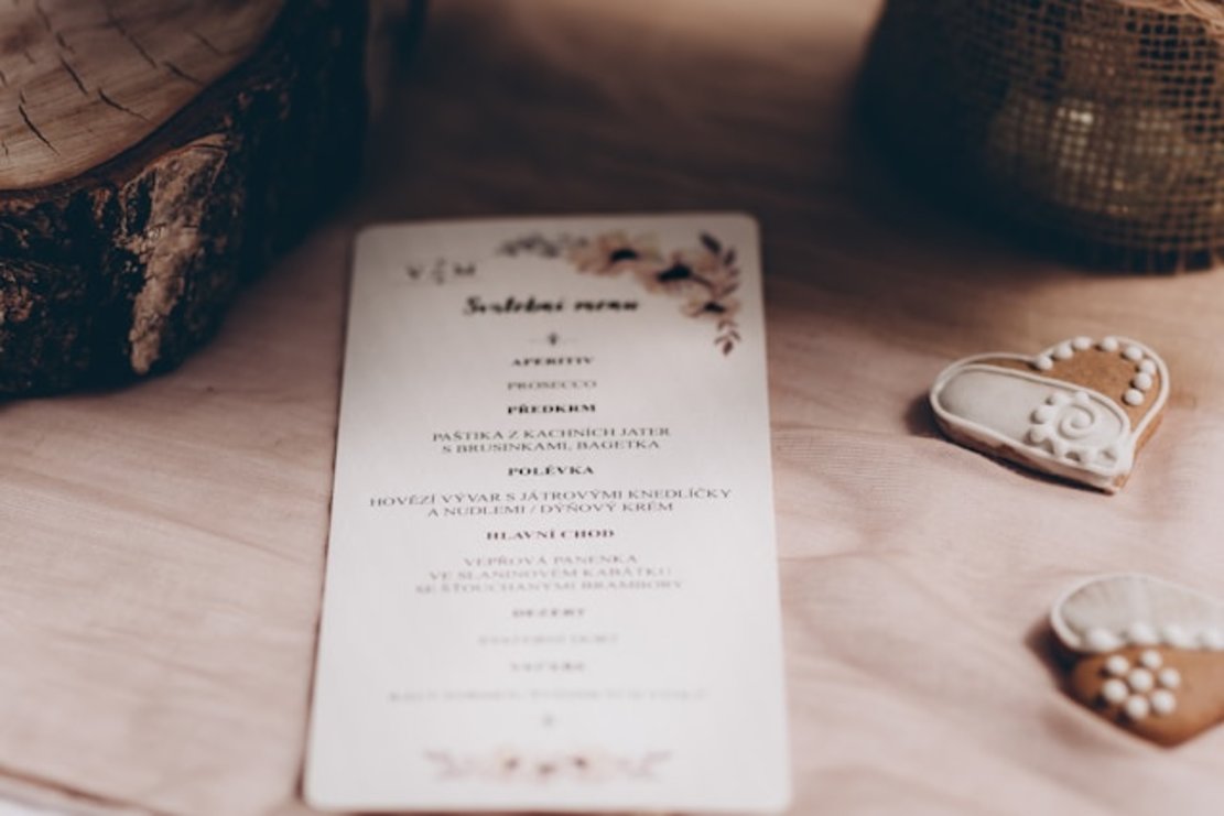
- Table d’Hôte Menu
The table d’hôte menu consists of several courses that customers can order from your restaurant. You fix the price, i.e., it remains constant, so your guests know the total cost.
The restaurant keeps the menu fixed but still offers some level of flexibility. For example, your guests can change the appetizers or desserts per their preferences. There is a limit to how many options are available to your guests. This makes it easier for your kitchen to prepare and serve the dishes. Table d’Hôte is also a French phrase for “host’s table.”
- Prix Fixe Menu
Prix Fixe comes from French and means “fixed price.” These types of menus have little to no variation. Your chefs can curate multiple courses, such as appetizers, entrees, and desserts, to create a memorable culinary experience.
The price is constant, so your guests know beforehand how much it costs per meal. You can customize the menu to account for dietary restrictions. Since you fix everything, your staff can streamline the operations and decrease wait times significantly.

- Tasting Menu
In the tasting menu, you serve dishes in smaller portions, generally determined by your chefs. This provides a unique culinary experience, as your chefs can showcase their skills, presentation, and deep understanding of flavor.
You can pair these dishes with seasonal or alcoholic beverages to complement the flavors.
Smaller servings can attract food enthusiasts to your restaurant because of the choice of ingredients and experience. Guests may even experiment with and try new dishes.
- Fixed Menu
A fixed menu is classic. You’ll find these types of menus in restaurants. They show all the items your guests can order. Your patrons love these menus because they create a sense of familiarity, as they always know what’s on the menu.
Also, your guests won’t take too long to place their orders.
Your kitchen will operate smoothly, even when you hire new staff. Moreover, inventory management is straightforward, as you know what and when you need various ingredients.
- Limited Menu
As the name suggests, these menus feature a minimal number of dishes. The difference is that your staff focuses on providing an exemplary dining experience for your guests. These dishes can become your signature, attracting a loyal community of regular diners. This can get more customers to your restaurant.
The operations are simple because of the smaller inventory of ingredients you need to store. It’s easier to train your staff as there’s a limited number of dishes.
Based on Food Categories
Are there other types of menus in the food and beverage industry? Yes, restaurants use food categories to classify the dishes and beverages.
- Main Menu
The main menu includes all the main dishes and courses you serve to your guests. This can include salads, soups, entrees, side dishes, and appetizers. The goal is to make it easy for your guests to navigate your menu and find what to order quickly. However, you don’t include any desserts or beverages in these types of menus in hotels.
- Children’s Menu
The children’s or kids’ menu is for children. Each dish comes with smaller portions. They are popular in establishments that families visit, as they ensure children can select meals they enjoy eating. The dishes tend to focus on what children find appetizing.
It ensures that children will find dishes they like. Families will prefer to dine at your restaurant because you cater to everyone’s needs. You’ll keep getting return customers due to this approach.
- Beverage Menu
A beverage menu walks your guests through all the alcoholic and non-alcoholic beverages you offer. These menus are what you see in bars and pubs. You can showcase a curated collection of your finest wines and whiskeys.
These beverages can also make great pairings for your dishes, enhancing the dining experience. You can even have seasonal offerings to keep things exciting for your patrons.
- Wine Menu
Your wine collection is your wine menu. You may categorize the alcoholic beverage based on the wine’s varietal, style, origin, and region. Include descriptions of the wine and tasting notes so your guests know what they want to try.
Train your staff to explain the different types of wine and how they complement various dishes. It can create an exquisite dining experience that attracts wine enthusiasts to your restaurant.
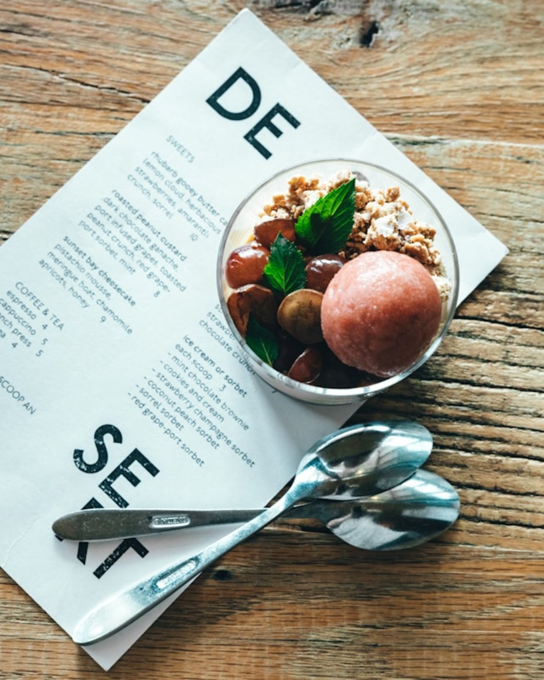
- Dessert Menu
No meal is complete without a dessert! You usually hand out your dessert menu when your guests have almost finished their meals. It gives them time to digest and savor the dishes you served while deciding what sweet treats to try.
These menus can increase your sales as you encourage your patrons to stick around and try one last dish. Moreover, if you have signature desserts, a dessert menu can ensure they get the attention of your guests.
- Vegetarian Menu
In a vegetarian menu, you show only meat-free options, i.e., you remove meats, poultry, and fish from the list. You can highlight vegan dishes, i.e., meals without dairy and animal-based ingredients. These types of menus appeal to a larger audience as you cater to diverse dietary needs and preferences.
- Gluten-Free Menu
Diners will ask for gluten-free options, i.e., meals that don’t contain barley, rye, and wheat. A gluten-free menu makes it easier for these guests to choose what they want to eat from your restaurant. Moreover, there is an increase in demand for gluten-free dishes.
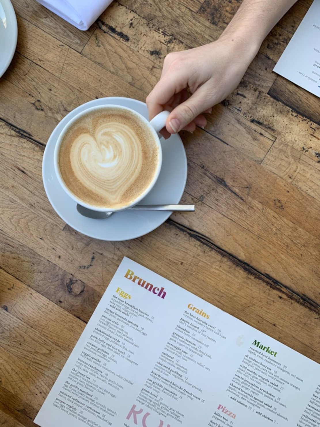
- Brunch Menu
The brunch menu combines breakfast and lunch meals. These dishes are for guests who visit your restaurant late in the morning or early afternoon. You can also include alcoholic beverages, especially cocktails, as they are popular drinks for brunch.
- Takeout Menu
You’ll always have guests who prefer takeaway over eating at your restaurant. A takeout menu highlights all the dishes your patrons can order. It’s a good idea to include dishes that are easy to carry and won’t spill out of their packaging.
- Catering Menu
A catering menu is for parties, corporate events, weddings, and other functions that draw large crowds. Your catering menu’s pricing and portion sizes will differ from what you serve regularly in your restaurant.
- Seasonal Menu
For the seasonal menu, you only show dishes that use seasonal ingredients. The ingredients are fresh and limited, making them appealing to your diners. You can add a mix of seasonal dishes and beverages to make the menu appealing to your guests.
- Holiday Menu
The holiday menu is a special menu that your restaurant uses once every year. It contains popular holiday dishes and beverages based on the festival you celebrate. These menus will appeal to people who want to celebrate the holiday season.
- Regional Menu
In a regional menu, the focus is on local dishes and beverages. It shows diners a specific region’s unique cultures and flavors. Use local ingredients and cooking styles to provide an authentic experience.
- Specialty Menu
The specialty menu includes signature meals or unique dishes highlighting your chef’s expertise. You can make them available briefly or cycle them throughout the year. Think of it as a curated selection of dishes that create a unique dining experience.
- Hybrid and Interactive Menus
Hybrid and interactive menus don’t focus on food categories. Instead, they’re all about how diners interact with your menu, usually through a screen. You may present your menus digitally or on a tablet.
These menus are popular because you can show your dishes in the best light and make them visually appealing.
Additional Menu Types
Here are some more restaurant menu styles you can use.
- Tasting Flight Menu
The tasting flight menu contains smaller portions of diverse dishes and beverages. They aim to appeal to adventurous diners, encouraging them to try new flavors. It makes the dining experience interactive and fun for your guests.
- Chef’s Choice Menu
Your chefs select the dishes and beverages on this menu. Since it uses seasonal or fresh ingredients, you can regularly change it, making the dining experience interesting for your guests.
- Low-Calorie/Health Menu
As trends shift towards healthy diets, diners want healthy restaurant meals. A low-calorie or health menu caters to these needs. The dishes are nutritious and filling but remain low in calories.
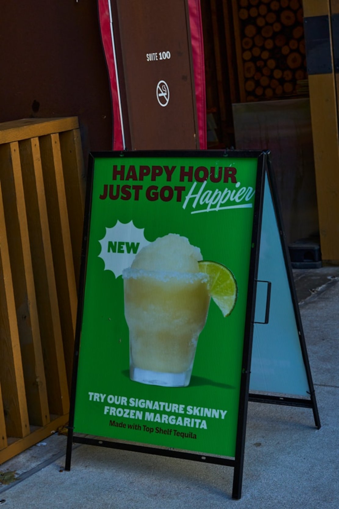
- Happy Hour Menu
The happy hour menu helps bring diners during off-peak hours to your restaurant. You either provide a discount or offer 1+1 for dishes and beverages. These menus have a time limit, which usually matches your off-peak hours.
- Pop-Up Menu
The pop-up menu is for temporary or pop-up restaurants. For example, if your restaurant has a stall at a music festival, you’ll use a pop-up menu. It’s a compact version of your full menu, with only a few dishes and beverages.
- Food Truck Menu
The food truck menu consists of all the dishes you serve to your guests from your food truck. The menu is smaller, and you can curate what is on this list. It should be flavorful and easy to prepare and consume because you must account for your truck’s size.
Ways To Display Menus
There are several ways to display different types of menus in the food and beverage industry, as highlighted below.
Traditional Display Methods
The majority of conventional restaurants often use the following traditional display methods.
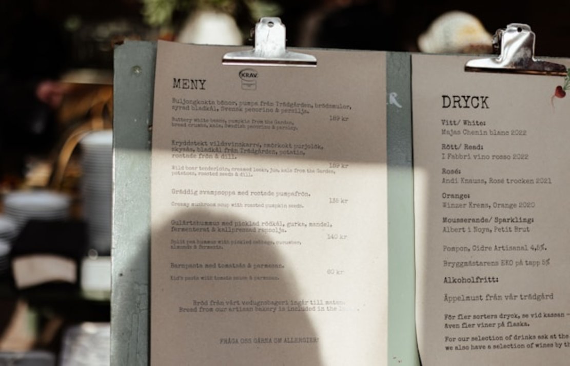
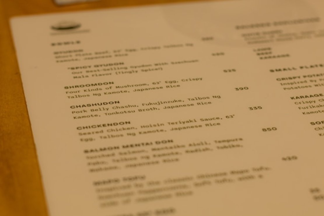
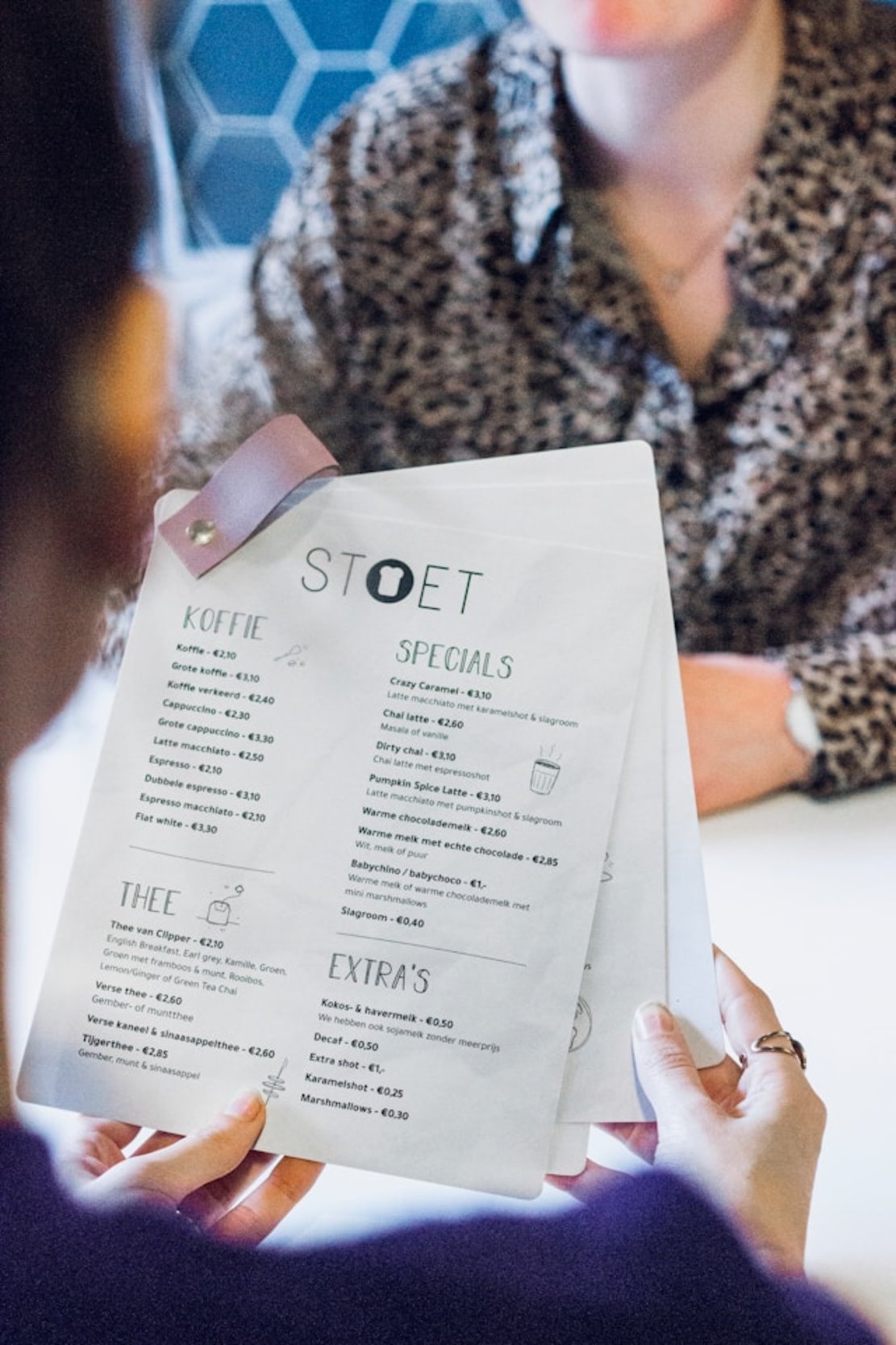
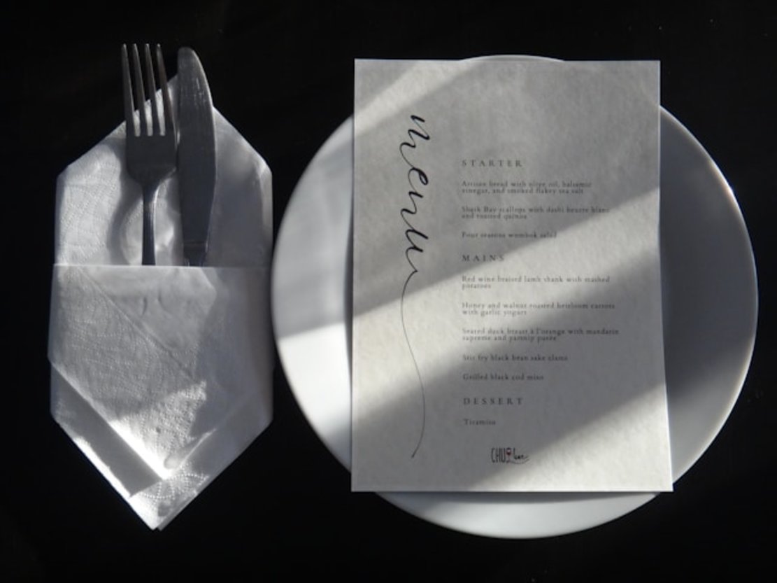
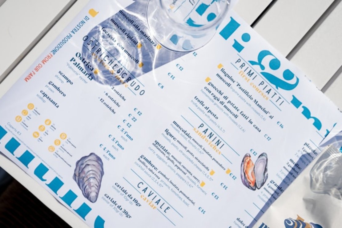
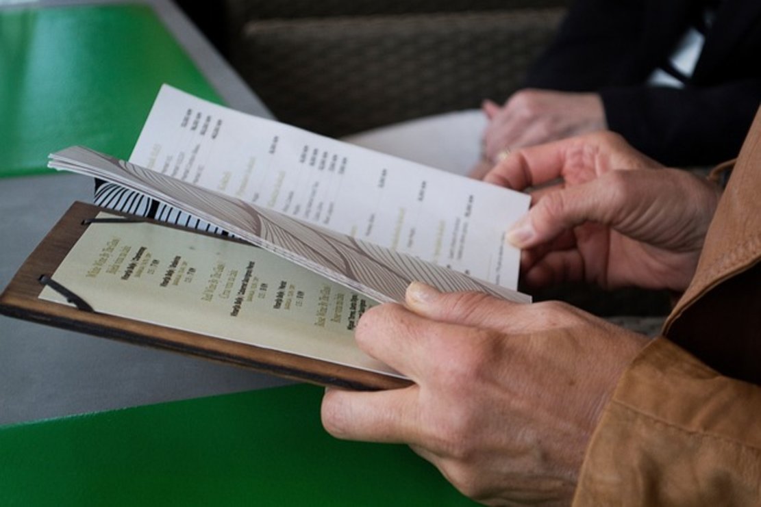
- Printed Menus
The classic, printed menu consists of a physical menu that diners can hold and read. It creates a sense of familiarity, as this is how most restaurants showcase their dishes. You can include your restaurant’s brand and provide detailed descriptions of the dishes.
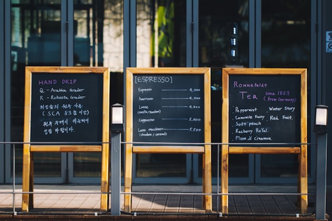
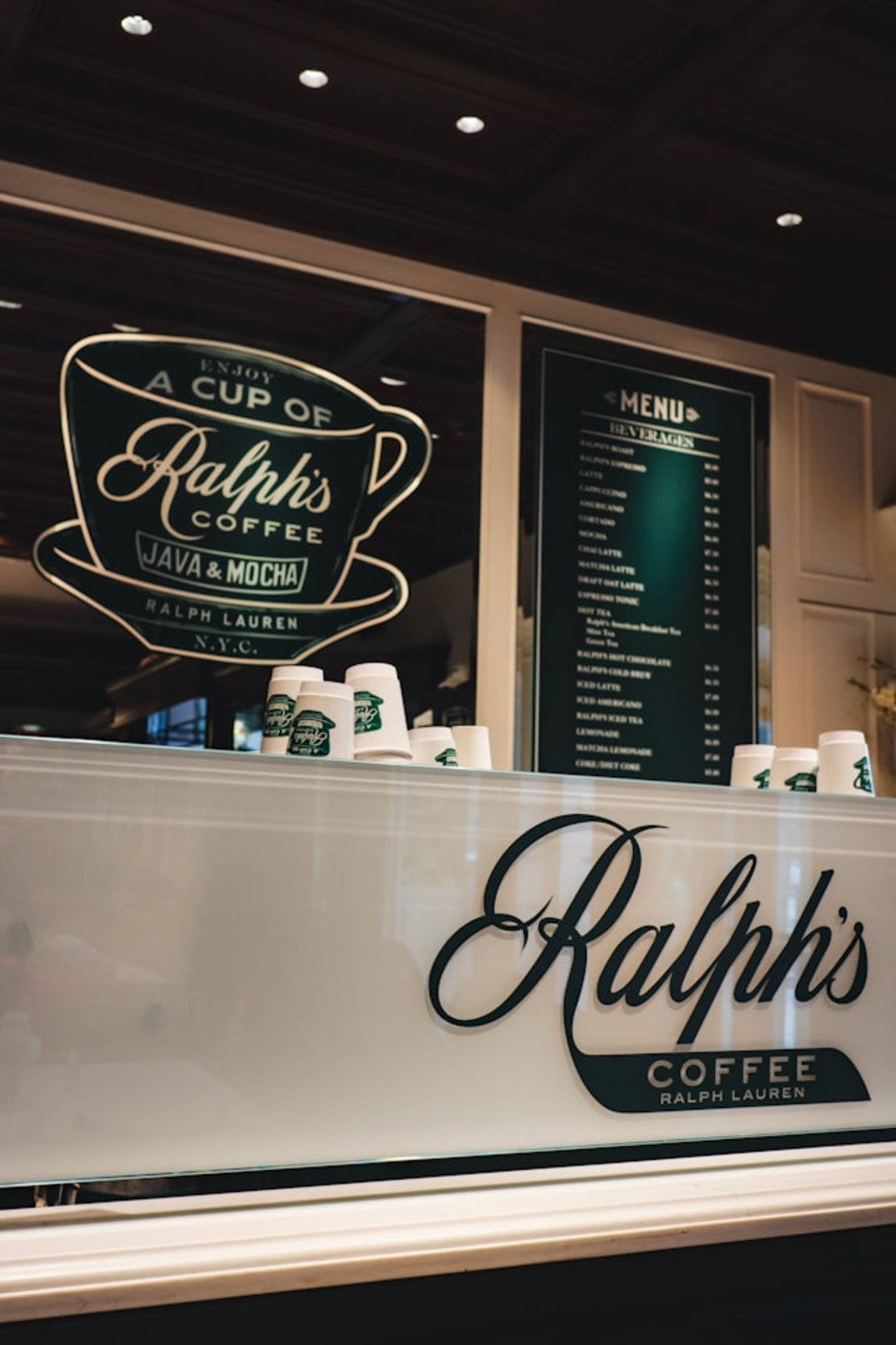
- Menu Boards and Signs
Menu boards and signs are large menus, so you display them on your restaurant’s walls, usually above the counter. You can even place these menus at the entrance of your eatery. By looking at these menus, your diners will know what’s there to eat.

- Tabletop Tent Menus
Tabletop tent menus or displayettes are small menus you place on your restaurant’s tables. They highlight the specials of the day or new dishes. You usually include your specials, beverages, and desserts in this menu.
- Disposable Menus
Disposable menus became popular due to the pandemic, as everyone wanted to stay safe. Your diners can use these menus once and discard them. It can also be good if you change your menus regularly.
Digital Solutions
Nowadays, restaurants are using the following digital solutions to display menus. For example, iMenuPro lets you design menus digitally.
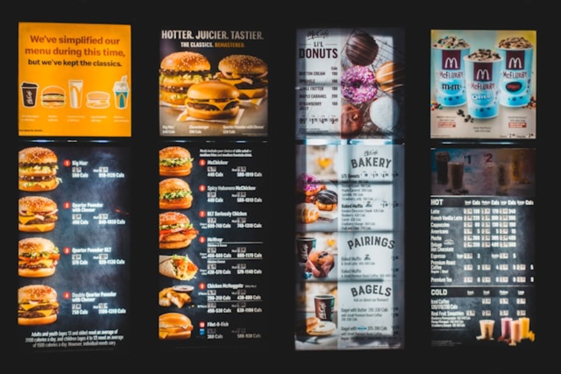
- Digital Menu Displays
You use a screen to show your menus to your diners. Screen menus are easy to maintain and update when including new dishes and offers. They can also contain food images to help diners decide what to order.
- QR Code Menus
Your guests have to scan the QR code with their phones to see the menus in QR code menus. These menus also grew in popularity during the pandemic. It is an excellent way to reduce paper waste and it’s accessible thanks to easy to find QR code generators.
- Online Ordering Systems
Online ordering systems contain digital versions of your menu. Your guests can visit your website or open a food delivery app to see your dishes and place orders. You can use these systems to place online orders and takeaways.
Unique Presentation Strategies
Presentation is everything, especially when it comes to menus. As it gives people an initial impression of your restaurant, you must get it right. Here are three tips to present your menus to your guests.
Visual Appeal and Readability
Your menus must look appealing to your guests because they influence what they order from your restaurant. We recommend a clean layout, i.e., it doesn’t feel crowded. There should be adequate spacing between each dish.
Additionally, you need to consider readability. It must be easy to read so people can easily pick what to eat. Some fonts make your dishes look fancy, but at the cost of readability. Use images and colors to draw attention to specific dishes.
It should also match your restaurant’s theme and vibe. In other words, it must look like a natural extension of your restaurant.
Creative Language
You can get creative with your descriptions of all the dishes and beverages you serve. The goal is to make your meals look appetizing using words alone. Describe the ingredients, flavors, cooking methods, and textures. Try incorporating storytelling in your menus to engage with your diners.
Avoid using plain descriptions, which make the dishes sound boring or normal. Spice them up with creative descriptions.
Interactive Menus
Interactive menus are handy because they make it easy for everyone to navigate your offerings. Your guests can filter based on their preferences or search for specific dishes. As highlighted earlier, you can include close-up shots of your dishes to make them appetizing to your diners.
When your diners are going through your menu, they’ll often ask if you have WiFi. Moreover, it’s become important for restaurants to provide free WiFi. But you can make this utility a tool that helps your restaurant grow with Beambox.
We can turn this free utility into a WiFi marketing tool that understands your customers. You can display personalized offers when customers connect to your WiFi. We can also collect valuable user information to help power your marketing solutions.
Join Beambox today so you can make your free utility into another source of revenue for your restaurant!
FAQ
Are there any questions you have about restaurant menus, like how many kinds of menus are in hotels? If yes, go through this section as we answer several questions we receive from customers.
What type of menu do most fast food restaurants use?
The majority of fast-food restaurants commonly use static menus. Some examples of fast-food restaurants that use these menus are KFC, McDonald’s, and Burger King. Usually, fast-food joints serve the same dishes, creating a sense of familiarity for diners. Moreover, guests can make faster decisions because fast-food restaurants organize the dishes based on specific categories.
How does a hybrid menu work?
A hybrid menu uses two or more styles of menus, i.e., a combination of multiple lists. It provides flexibility, as diners can choose from a large selection of dishes and beverages.
How do I choose the right type of menu for my restaurant concept?
You can choose the right type of menu for your restaurant concept using the following criteria:
- The type of restaurant, i.e., are you a fast food, fine dining, or casual restaurant?
- Your target audience, i.e., who you want to attract to your restaurant?
- The ingredients, i.e., do you use seasonal, local, or easily available ingredients?
- The average ticket size, i.e., what is your target average spend per diner at your restaurant?
- Staff training and expertise, i.e., what can they handle?
What metrics should restaurants use to assess menu performance?
You should use the following metrics to assess menu performance:
- The popularity of various dishes and beverages
- The profit margin, i.e., the cost to prepare each meal versus how much you charge
- Table turnover, i.e., how much time it takes for diners to leave your restaurant after sitting at a table
You should also listen to customer feedback, especially when they have good points. For example, sometimes, they can say it’s hard to read the descriptions because of the fonts.
How many types of menus in a hotel?
Hotels use a wide range of menus, such as:
- À La Carte
- Table ď Hôte
- Static menu
- Limited menu
- Fixed menu
- Du Jour menu
- Cycle menu
- Prix Fixe menu
- Tasting menu
- Children’s menu
- Desserts menu
And more.
Get Started With Free WiFi Marketing
Beambox helps businesses like yours grow with data capture, marketing automation and reputation management.
Sign up for 30 days free
